
Keyboard-navigation and -control for the web: omnibars, editable hotkeys, search, modes/sequences.
Documentation & Demos: kbd.rbw.sh
- Quick Start
- Motivation / Examples
- Core Concepts
- Components
- Styling
- Mobile Support
- Patterns
- Low-Level Hooks
- Debugging
- License
npm install use-kbd # or: pnpm add use-kbdor install latest GitHub dist branch commit width pds:
pds init -H runsascoded/use-kbdimport { HotkeysProvider, ShortcutsModal, Omnibar, LookupModal, SequenceModal, useAction } from 'use-kbd'
import 'use-kbd/styles.css'
function App() {
return (
<HotkeysProvider>
<Dashboard />
<ShortcutsModal /> {/* "?" modal: view/edit key-bindings */}
<Omnibar /> {/* "⌘K" omnibar: search and select actions */}
<LookupModal /> {/* "⌘⇧K": look up actions by key-binding */}
<SequenceModal /> {/* Inline display for key-sequences in progress */}
</HotkeysProvider>
)
}
function Dashboard() {
const { save } = useDocument() // Function to expose via hotkeys / omnibar
// Wrap function as "action", with keybinding(s) and omnibar keywords
useAction('doc:save', {
label: 'Save document',
group: 'Document',
defaultBindings: ['meta+s'],
handler: save,
})
return <Editor />
}- Drop-in UI components:
ShortcutsModal: view/edit key-bindingsOmnibar: search and select actionsLookupModal: look up actions by key-bindingSequenceModal: autocomplete multi-key sequences
- Register functions as "actions" with
useAction - Easy theming with CSS variables


- ctbk.dev (GitHub · usage · diff) — Citi Bike trip data explorer
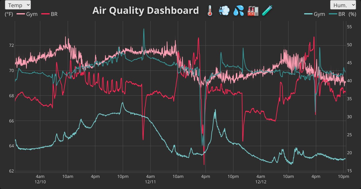
- air.rbw.sh (GitHub · usage · diff) — Awair air quality dashboard
- jct.rbw.sh (GitHub · usage · diff) — Jersey City 3D tax map
- voro.rbw.sh (GitHub · usage) — Image Voronoi generator
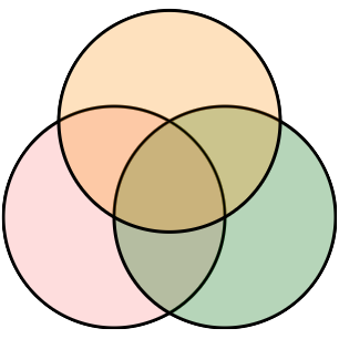
- runsascoded.com/apvd (GitHub · usage) — Area-Proportional Venn Diagrams
Most web apps ship a static, read-only shortcuts list (at most). use-kbd provides a full keyboard UX layer:
 |
 |
 |
| Feature |  Gmail Gmail |
 GitHub GitHub |
 Drive Drive |
 use-kbd use-kbd |
|---|---|---|---|---|
| View shortcuts | 📄 flat | 📊 grouped | 📊 grouped | ✅ grouped, collapsible |
| Edit bindings | ❌ | ❌ | ❌ | ✅ click-to-edit |
| Search / filter | ❌ | ❌ | 🔍 filter only | ✅ fuzzy omnibar |
| Command palette | ❌ | ⚡ separate | ❌ | ✅ integrated |
| Sequences | ✅ g i |
✅ G C |
❌ | ✅ + live preview |
| Conflict detection | ❌ | ❌ | ❌ | ✅ real-time |
| Import / Export | ❌ | ❌ | ❌ | ✅ JSON |
| Modes | ❌ | ❌ | ❌ | ✅ editable groups |
| Arrow groups | ❌ | ❌ | ❌ | ✅ compact rows |
| Action pairs / triplets | ❌ | ❌ | ❌ | ✅ collapsed with / |
| Digit placeholders | ❌ | ❌ | ❌ | ✅ \d \d+ \f |
| Multiple bindings | ➖ some | ➖ "or" | ➖ some | ✅ click + to add |
GitHub's command palette (⌘K) is conceptually similar to use-kbd's omnibar, but disconnected from the shortcuts modal. Drive has a search bar (rare!), but it's filter-only and read-only. Gmail requires a Settings toggle before shortcuts work at all.
- macOS and GDrive menu search
- Superhuman omnibar
- Vimium keyboard-driven browsing
- Android searchable settings
Register any function with useAction:
useAction('view:toggle-sidebar', {
  label: 'Toggle sidebar',
  description: 'Show or hide the sidebar panel',  // Tooltip in ShortcutsModal
  group: 'View',
  defaultBindings: ['meta+b', 'meta+\\'],
  keywords: ['panel', 'navigation'],
  handler: () => setSidebarOpen(prev => !prev),
})
Actions automatically unregister when the component unmounts—no cleanup needed.
Conditionally disable actions with enabled:
useAction('doc:save', {
  label: 'Save',
  defaultBindings: ['meta+s'],
  enabled: hasUnsavedChanges,  // Action hidden when false
  handler: save,
})
Protect essential bindings from removal with protected:
useAction('app:shortcuts', {
  label: 'Show shortcuts',
  defaultBindings: ['?'],
  protected: true,  // Users can add bindings, but can't remove this one
  handler: () => openShortcutsModal(),
})
Control display order within a group with sortOrder (lower values appear first; default 0, ties broken by registration order):
useAction('app:shortcuts', {
  label: 'Show shortcuts',
  sortOrder: 0,   // Appears first
  // ...
})
useAction('app:omnibar', {
  label: 'Command palette',
  sortOrder: 1,   // Appears second
  // ...
})Collapse two inverse actions into a single compact row in ShortcutsModal with useActionPair:
import { useActionPair } from 'use-kbd'

useActionPair('view:zoom', {
  label: 'Zoom in / out',
  group: 'View',
  actions: [
    { defaultBindings: ['='], handler: () => zoomIn() },
    { defaultBindings: ['-'], handler: () => zoomOut() },
  ],
})
Creates view:zoom-a and view:zoom-b actions, displayed as one row: Zoom in / out [=] / [-]
Same pattern for three related actions with useActionTriplet:
import { useActionTriplet } from 'use-kbd'

useActionTriplet('view:slice', {
  label: 'Slice along X / Y / Z',
  group: 'View',
  actions: [
    { defaultBindings: ['x'], handler: () => sliceX() },
    { defaultBindings: ['y'], handler: () => sliceY() },
    { defaultBindings: ['z'], handler: () => sliceZ() },
  ],
})
Creates view:slice-a, -b, -c actions, displayed as: Slice along X / Y / Z [X] / [Y] / [Z]
Multi-key sequences like Vim's g g (go to top) are supported:
useAction('nav:top', {
  label: 'Go to top',
  defaultBindings: ['g g'],  // Press g, then g again
  handler: () => scrollToTop(),
})
The SequenceModal shows available completions while typing a sequence.
Bindings can include digit placeholders for numeric arguments. Use \d+ for one or more digits:
useAction('nav:down-n', {
  label: 'Down N rows',
  defaultBindings: ['\\d+ j'],  // e.g., "5 j" moves down 5 rows
  handler: (e, captures) => {
    const n = captures?.[0] ?? 1
    moveDown(n)
  },
})
Use \f for float placeholders (integers or decimals):
useAction('transform:scale', {
  label: 'Scale values by N',
  defaultBindings: ['o \\f'],  // e.g., "o 1.5" scales by 1.5
  handler: (e, captures) => {
    const factor = captures?.[0] ?? 1
    scaleBy(factor)
  },
})
When a user selects a placeholder action from the Omnibar or LookupModal without providing a number, a parameter entry prompt appears to collect the value.
Modes are sticky shortcut scopes—enter a mode via a key sequence, then use short single-key bindings that only exist while the mode is active. Escape exits the mode.
import { useMode, useAction, ModeIndicator } from 'use-kbd'

function Viewport() {
  const mode = useMode('viewport', {
    label: 'Pan & Zoom',
    color: '#4fc3f7',
    defaultBindings: ['g v'],
  })

  useAction('viewport:pan-left', {
    label: 'Pan left',
    mode: 'viewport',                // Only active when mode is active
    defaultBindings: ['h', 'left'],
    handler: () => panLeft(),
  })

  useAction('viewport:zoom-in', {
    label: 'Zoom in',
    mode: 'viewport',
    defaultBindings: ['='],
    handler: () => zoomIn(),
  })

  return <ModeIndicator position="bottom-left" />
}
Key behaviors:
- Global passthrough – Keys not bound in the mode pass through to global bindings (default:
passthrough: true) - Mode shadows global – If a mode action and a global action share a key, the mode action wins while active
- Toggle – The activation sequence also deactivates the mode (default:
toggle: true) - Escape exits – Pressing Escape deactivates the mode (default:
escapeExits: true) - Omnibar integration – Mode-scoped actions appear in the Omnibar with a mode badge; executing one auto-activates the mode
- ShortcutsModal – Mode actions appear in their own group with a colored left border
Register four directional arrow-key actions as a compact group with useArrowGroup. They display as a single row in ShortcutsModal, and the modifier prefix can be edited as a unit (hold modifiers + press Enter or an arrow key to confirm):
import { useArrowGroup } from 'use-kbd'

useArrowGroup('camera:pan', {
  label: 'Pan',
  group: 'Camera',
  mode: 'viewport',
  defaultModifiers: ['shift'],
  handlers: {
    left:  () => pan(-1, 0),
    right: () => pan(1, 0),
    up:    () => pan(0, -1),
    down:  () => pan(0, 1),
  },
  extraBindings: {                  // Optional non-arrow aliases
    left: ['h'], right: ['l'],
    up: ['k'], down: ['j'],
  },
})
This creates four actions (camera:pan-left, …, camera:pan-down), each bound to shift+arrow{dir} plus any extras. In ShortcutsModal they collapse into one row showing ⇧ + ← → ↑ ↓.
For convenience, common key names have shorter aliases:
| Alias | Key |
|---|---|
left, right, up, down |
Arrow keys |
esc |
escape |
del |
delete |
return |
enter |
pgup, pgdn |
pageup, pagedown |
useAction('nav:prev', {
  label: 'Previous item',
  defaultBindings: ['left', 'h'],  // 'left' = 'arrowleft'
  handler: () => selectPrev(),
})Users can edit bindings in the ShortcutsModal. Changes persist to localStorage using the storageKey you provide.
Users can export their customized bindings as JSON and import them in another browser or device:
<ShortcutsModal editable /> // Shows Export/Import buttonsThe exported JSON contains:
version– Library version for compatibilityoverrides– Custom key→action bindingsremovedDefaults– Default bindings the user removed
Programmatic access via the registry:
const { registry } = useHotkeysContext()

// Export current customizations
const data = registry.exportBindings()

// Import (replaces current customizations)
registry.importBindings(data)
Customize the footer with footerContent:
<ShortcutsModal
  editable
  footerContent={({ exportBindings, importBindings, resetBindings }) => (
    <div className="my-custom-footer">
      <button onClick={exportBindings}>Download</button>
      <button onClick={importBindings}>Upload</button>
    </div>
  )}
/>
Pass footerContent={null} to hide the footer entirely.
Wrap your app to enable the hotkeys system:
<HotkeysProvider config={{
  storageKey: 'use-kbd',      // localStorage key for user overrides (default)
  sequenceTimeout: Infinity,  // ms before sequence times out (default: no timeout)
  disableConflicts: false,    // Disable keys with multiple actions (default: false)
  enableOnTouch: false,       // Enable hotkeys on touch devices (default: false)
  builtinGroup: 'Meta',       // Group name for built-in actions (default: 'Meta')
}}>
  {children}
</HotkeysProvider>
Note: Modal/omnibar trigger bindings are configured via component props (defaultBinding), not provider config.
Displays all registered actions grouped by category. Users can click bindings to edit them on desktop.
<ShortcutsModal
  editable                    // Enable editing, Export/Import buttons
  groups={{ nav: 'Navigation', edit: 'Editing' }}
  hint="Click any shortcut to customize"
/>Command palette for searching and executing actions:
<Omnibar
  placeholder="Type a command..."
  maxResults={10}
/>Browse and filter shortcuts by typing key sequences. Press ⌘⇧K (default) to open. Supports parameter entry for actions with digit placeholders—type digits before selecting an action to use them as the value.
<LookupModal defaultBinding="meta+shift+k" />Open programmatically with pre-filled keys via context:
const { openLookup } = useHotkeysContext()

// Open with "g" already typed (shows all "g ..." sequences)
openLookup([{ key: 'g', modifiers: { ctrl: false, alt: false, shift: false, meta: false } }])Shows pending keys and available completions during sequence input. No props needed—it reads from context.
<SequenceModal />Fixed-position pill showing the active mode. Automatically hides when no mode is active.
<ModeIndicator position="bottom-right" /> {/* or: bottom-left, top-right, top-left */}Floating action button (FAB) with expandable secondary actions. Opens the omnibar by default, with optional extra actions.
<SpeedDial
  actions={[
    { key: 'github', label: 'GitHub', icon: <GitHubIcon />, href: 'https://github.com/...' },
  ]}
/>Import the default styles:
import 'use-kbd/styles.css'Customize with CSS variables:
.kbd-modal,
.kbd-omnibar,
.kbd-sequence {
  --kbd-bg: #1f2937;
  --kbd-text: #f3f4f6;
  --kbd-border: #4b5563;
  --kbd-accent: #3b82f6;
  --kbd-kbd-bg: #374151;
}
Dark mode is automatically applied via [data-theme="dark"] or .dark selectors.
While keyboard shortcuts are primarily a desktop feature, use-kbd provides solid mobile UX out of the box. Try the demos on your phone →
What works on mobile:
- Omnibar search – Tap the search icon or
⌘Kbadge to open, then search and execute actions - LookupModal – Browse shortcuts by typing on the virtual keyboard
- ShortcutsModal – View all available shortcuts (editing disabled since there's no physical keyboard)
- Back button/swipe – Native gesture closes modals
- Responsive layouts – All components adapt to small screens
Demo-specific features:
- Table demo – Tap search icon in the floating controls to open omnibar
- Canvas demo – Touch-to-draw support alongside keyboard shortcuts
For apps that want keyboard shortcuts on desktop but still need the omnibar/search on mobile, this covers the common case without extra configuration.
Make navigation links discoverable in the omnibar by registering them as actions. Here's a reference implementation for react-router:
import { useEffect, useRef } from 'react'
import { Link, useLocation, useNavigate } from 'react-router-dom'
import { useMaybeHotkeysContext } from 'use-kbd'

interface ActionLinkProps {
  to: string
  label?: string
  group?: string
  keywords?: string[]
  defaultBinding?: string
  children: React.ReactNode
}

export function ActionLink({
  to,
  label,
  group = 'Navigation',
  keywords,
  defaultBinding,
  children,
}: ActionLinkProps) {
  const ctx = useMaybeHotkeysContext()
  const navigate = useNavigate()
  const location = useLocation()

  const isActive = location.pathname === to
  const effectiveLabel = label ?? (typeof children === 'string' ? children : to)
  const actionId = `nav:${to}`

  // Use ref to avoid re-registration on navigate change
  const navigateRef = useRef(navigate)
  navigateRef.current = navigate

  useEffect(() => {
    if (!ctx?.registry) return

    ctx.registry.register(actionId, {
      label: effectiveLabel,
      group,
      keywords,
      defaultBindings: defaultBinding ? [defaultBinding] : [],
      handler: () => navigateRef.current(to),
      enabled: !isActive,  // Hide from omnibar when on current page
    })

    return () => ctx.registry.unregister(actionId)
  }, [ctx?.registry, actionId, effectiveLabel, group, keywords, defaultBinding, isActive, to])

  return <Link to={to}>{children}</Link>
}
Usage:
<ActionLink to="/docs" keywords={['help', 'guide']}>Documentation</ActionLink>
<ActionLink to="/settings" defaultBinding="g s">Settings</ActionLink>
Adapt for Next.js, TanStack Router, or other routers by swapping the router hooks.
For advanced use cases, the underlying hooks are also exported:
Register shortcuts directly without the provider:
useHotkeys(
  { 't': 'setTemp', 'meta+s': 'save' },
  { setTemp: () => setMetric('temp'), save: handleSave }
)Capture key combinations from user input:
const { isRecording, startRecording, display } = useRecordHotkey({
  onCapture: (sequence, display) => saveBinding(display.id),
})Manage parameter entry state for actions with digit placeholders. Used internally by Omnibar and LookupModal; useful for custom UIs:
const paramEntry = useParamEntry({
  onSubmit: (actionId, captures) => executeAction(actionId, captures),
  onCancel: () => inputRef.current?.focus(),
})

// Start entry when user selects an action with placeholders
paramEntry.startParamEntry({ id: 'nav:down-n', label: 'Down N rows' })

// Render: paramEntry.isEnteringParam, paramEntry.paramInputRef,
// paramEntry.paramValue, paramEntry.handleParamKeyDownRegister a keyboard mode. See Modes for details.
const mode = useMode('edit', {
  label: 'Edit Mode',
  color: '#ff9800',
  defaultBindings: ['g e'],
})
// mode.active, mode.activate(), mode.deactivate(), mode.toggle()Register four directional arrow actions as a group. See Arrow Groups for details.
useArrowGroup('nav:scroll', {
  label: 'Scroll',
  defaultModifiers: [],
  handlers: {
    left:  () => scrollLeft(),
    right: () => scrollRight(),
    up:    () => scrollUp(),
    down:  () => scrollDown(),
  },
})Add custom result sources to the Omnibar (e.g., search APIs, in-memory data):
useOmnibarEndpoint('search', {
  group: 'Search Results',
  priority: 50,
  minQueryLength: 2,
  fetch: async (query, signal) => {
    const results = await searchAPI(query, { signal })
    return { entries: results.map(r => ({ id: r.id, label: r.title, handler: () => navigate(r.url) })) }
  },
})
Sync endpoints skip debouncing for instant results:
useOmnibarEndpoint('filters', {
  group: 'Quick Filters',
  filter: (query) => ({
    entries: allFilters
      .filter(f => f.label.toLowerCase().includes(query.toLowerCase()))
      .map(f => ({ id: f.id, label: f.label, handler: f.apply })),
  }),
})Register two inverse actions as a compact pair. See Action Pairs.
Register three related actions as a compact triplet. See Action Triplets.
Wraps useHotkeys with localStorage persistence and conflict detection.
use-kbd uses the debug package for internal logging, controlled via localStorage.debug. Zero output by default—no config needed in downstream apps.
Enable in browser devtools:
localStorage.debug = 'use-kbd:*'  // All namespaces
location.reload()
Available namespaces:
| Namespace | What it logs |
|---|---|
use-kbd:hotkeys |
Key matching, execution, sequence state |
use-kbd:recording |
Recording start/cancel/submit, hash cycling |
use-kbd:registry |
Action register/unregister, binding changes, keymap recomputation |
use-kbd:modes |
Mode activate/deactivate, effective keymap |
Filter to a single namespace for focused debugging:
localStorage.debug = 'use-kbd:hotkeys' // Only key handlingMIT