This projected consisted of 3 major components:
- Data Collection/Cleaning/Preprocessing
- Exploratory Data Analysis
- Time Series Forecasting and then put into a webapp using Dash
The data comes from a reputable source - Toronto Real Estate Board (TREB) and was collected with permission
The dataset was aggregated from a script I created and it consists of time series data ranging from 1996 to current year for several municipalities/communities and home types.
The columns in the dataset are: Date, Sales, Dollar Volume, Average Price, New Listings, SNLR, Active Listings, MOI, Average DOM, Average SP/LP, Municipality, Communities, HomeType. and I have provided a data dictionary in the glossary section.
The municipalities in the dataset are: Dufferin Durham Halton Peel Simcoe Toronto York and each are broken down into communities.
The cities/communities in the dataset are: Brampton, Caledon, Mississauga, Ajax, Brock, Clarington, Oshawa, Pickering, Scugog, Uxbridge, Whitby, Aurora, East Gwillimbury, Georgina, King, Markham, Newmarket, Richmond Hill, Vaughan, Whitchurch-Stouffville, Burlington, Halton Hills, Milton, Oakville, Orangeville, Toronto C01, Toronto C02, Toronto C03, Toronto C04, Toronto C06, Toronto C07, Toronto C08, Toronto C09, Toronto C10, Toronto C11, Toronto C12, Toronto C13, Toronto C14, Toronto C15, Toronto E01, Toronto E02, Toronto E03, Toronto E04, Toronto E05, Toronto E06, Toronto E07, Toronto E08, Toronto E09, Toronto E10, Toronto E11, Toronto W01, Toronto W02, Toronto W03, Toronto W04, Toronto W05, Toronto W06, Toronto W07, Toronto W08, Toronto W09, Toronto W10, Adjala-Tosorontio, Bradford West Gwillimbury, Essa, Innisfil, New Tecumseth
The types of homes are: Townhouses, Condo Apartments, Condo Townhouses, Co-Op Apartments, Co-Ownership Apartments, Detached Condos, Detached Houses, Links, and Semi-Detached Homes
 A map can be seen in the webapp under the map tab.
The data is updated once a month and can be updated using a task scheduler. The collection of the data takes a long time and it isn't possible to retrieve the new data due to the UI.
There is an in-depth notebook for EDA which is aimed to show summary statistics per community and answer some business questions in regard to trend, demand, supply, etc.
The time series forecasting was done using pytorch-forecasting which is a great library for creating deep learning time series models. The model used in this analysis was the Temporal Fusion Transformer
The reason why I will go with the deep learning approach for time series forecasting rather than the traditional time series methods is because recently deep learning (neural networks) has outperformed traditional methods in time series forecasting. Moreover the deep learning approach can properly handle covariates. Neural network architectures can be designed with an inherent understanding of time, i.e. they automatically make a connection between temporally close data points and thus they can capture complex time dependencies. Neural networks employ continuous activation functions and are particularly good at interpolation in high-dimensional spaces, i.e. they can be used to optimize inputs.
The objective of the notebook is to investigate forecasting of monthly home prices. There are many approaches to time series forecasting and it's a very complex topic. Forecasting monthly prices can be very very beneficial since it can give a person an idea of when the best time to buy or sell is (based on seasonality) and which cities might have the best ROI.
Putting it altogether - the webapp, deployed on heroku.
There are 4 tabs:
- Plots - to show the time series plots of several variables including market indicators.
- Table View - to show raw data and an roi calculator based on historic data
- Forecasts - probably the most beneficial which shows the forecasted price difference between the forecasted year and the previous year
- Map - shows the map view of all the communities
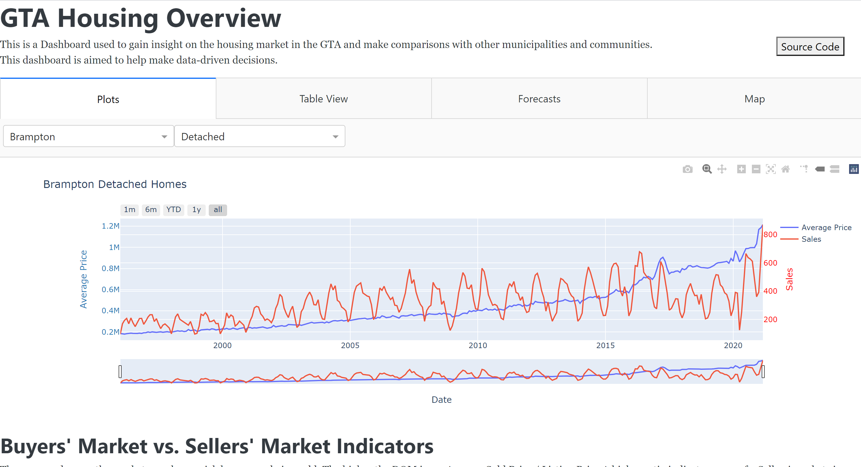
Sales - # of Home sales Dollar Volume - Total amount paid for homes in dollars
Average Price - Dollar Volume/Sales
New Listings - # of new listings for the month
SNLR - Sales to New Listing Ratio: The ratio between the number of homes sold and the number of new listings entered into the system during the month. Fifty per cent represents a balanced market. A higher ratio indicates more of a Sellers’ market; a lower ratio indicates more of a Buyers’ market.
Active Listings - # of listings active in the month
MOI - Months on Inventory: The number of months it would take for all current listings (as of the end of each month) to sell. As the MOI moves higher, there are more Sellers than Buyers. As the MOI moves lower, there are more Buyers than Sellers (putting upward pressure on prices).
Average DOM - Average days on the market
Average SP/LP - Average Sold Price / Listing Price A higher ratio indicates more of a Sellers' market since people are paying more than asking. A lower ratio indicates more of a Buyers' market since people are paying less than asking.
- What is the market trend?
- Which munipalities are performing better and for which home types?
- Which munipalities are emerging?
- Is there a pattern? (e.g. seasonality, cyclic)
- Are more people buying in the summer or winter?
- Is there a pattern to when it's a buyers' market vs sellers' market and vice versa?
- What is the trend for home types desired?
- Which munipalities have the most sales?
- Prediction: Which municipality would give you the best return?
- Prediction: Which hometypes would give you the best return?
- Prediction: When is the best time to buy? When is the best time to sell?