A clean and configurable tabs card for Home Assistant Dashboards.
Buy me a coffee: https://buymeacoffee.com/mysmarthomeblog
Subscribe to Youtube channel: https://www.youtube.com/@My_Smart_Home
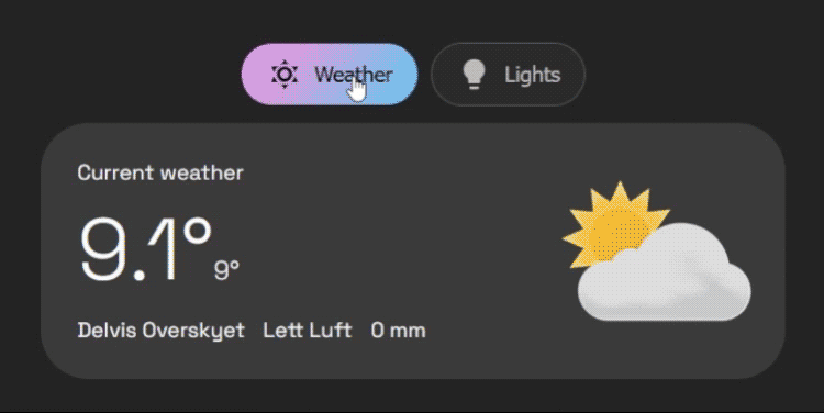
- Organize any cards into a clean tabbed layout
- Top or bottom tab positioning
- Start/center/end tab alignment
- Per-tab icon, title, badge template, and deep-link
id - Dynamic tab visibility with
entity,template, anduserconditions - Dynamic default tab rules
- Swipe navigation with smart conflict blocking for nested swipe/slider cards
- Optional swipe animations
- Optional tab memory (
false,true,per_device) - Optional haptic feedback on supported devices
- Extensive style options for tabs and container
- Visual editor with:
- Card list management (move/edit/delete)
- Card picker for adding cards to a tab
- Per-card modal editing via Home Assistant card editor
- Go to the HACS page in your Home Assistant instance.
- Click the three-dot menu in the top right.
- Select "Custom repositories".
- In the "Repository" field, paste the URL of this repository (https://github.com/agoberg85/home-assistant-simple-tabs).
- For "Category", select "Dashboard".
- Click "Add".
- The
simple-tabs-cardwill now appear in the HACS Frontend list. Click "Install".
- Download the
simple-tabs.jsfile from the latest release. - Copy the file to the
wwwdirectory in your Home Assistantconfigfolder. - In your Lovelace dashboard, go to "Manage Resources" and add a new resource:
- URL:
/local/simple-tabs.js - Resource Type:
JavaScript Module
- URL:
type: custom:simple-tabs
tabs:
  - title: Home
    icon: mdi:home
    card:
      type: markdown
      content: Home content
  - title: Climate
    icon: mdi:thermometer
    card:
      type: thermostat
entity: climate.living_roomYou can provide either:
card(single card)cards(list of cards)
When cards is used, Simple Tabs wraps them as a vertical stack automatically.
tabs:
  - title: Living Room
    icon: mdi:sofa
    cards:
      - type: entity
        entity: light.living_room
      - type: thermostat
entity: climate.living_room- The editor now shows a card list for each tab.
- Use the picker under the list to add cards.
- Use the edit icon to open Home Assistant's native card editor modal for each card.
- Manual YAML mode is still fully supported in dashboard YAML view.
| Name | Type | Required? | Description | Default |
|---|---|---|---|---|
type |
string | Required | custom:simple-tabs |
|
tabs |
list | Required | A list of tab objects to display. See below. | |
alignment |
string | Optional | Justification for the row of tabs. (start, center, end) |
'center' |
default_tab |
number/list | Optional | Defines the default tab. Can be a static number (1-based) or a list of conditional rules (see Advanced Configuration). | 1 |
hide_inactive_tab_titles |
boolean | Optional | If true, hides the title text on tabs that are not currently active (showing only the icon). |
false |
show_fade |
boolean | Optional | Enable fade mask on tab row edges when horizontal scrolling is possible. | true |
pre-load |
boolean | Optional | If true, renders all tab content on load for faster switching. |
false |
background-color |
string | Optional | CSS color for the button background. | none |
border-color |
string | Optional | CSS color for the button border. | Your theme's divider-color |
text-color |
string | Optional | CSS color for the button text. | Your theme's secondary-text-color |
hover-color |
string | Optional | CSS color for button text and border on hover. | Your theme's primary-text-color |
active-text-color |
string | Optional | CSS color for the active tab's text. | Your theme's text-primary-color |
active-background |
string | Optional | CSS color/gradient for the active tab's background. | Your theme's primary-color |
container_background |
string | Optional | CSS color/gradient for the background color of the container. | none |
container_padding |
string | Optional | Container padding | 12px |
container_rounding |
string | Optional | Border radius of the container | 32px |
tabs_gap |
string | Optional | Gap between buttons | 6px |
button_padding |
string | Optional | Padding inside each button | 12px |
tab_position |
string | Optional | Position of tabs. (top, bottom) |
'top' |
enable_swipe |
boolean | Optional | Enable swipe gestures to switch tabs on mobile. | true |
swipe_animation |
boolean | Optional | Enable animated transitions when switching tabs via swipe/click. | true |
swipe_threshold |
number | Optional | Pixels of movement required to trigger a swipe. | 50 |
remember_tab |
boolean/string | Optional | Remember last selected tab. (false, true, 'per_device') |
false |
haptic_feedback |
boolean | Optional | Vibration feedback on tab change (mobile only). | false |
Each entry in the tabs list is an object with the following properties:
| Name | Type | Required? | Description |
|---|---|---|---|
title |
string | Optional* | The text to display on the tab. Can be jinja template |
icon |
string | Optional* | An MDI icon to display next to the title (e.g., mdi:lightbulb). Can be jinja template |
card |
object | Conditionally required | A standard Lovelace card configuration (single-card mode). |
cards |
list | Conditionally required | List of Lovelace card configurations (multi-card mode). |
conditions |
list | Optional | A list of conditions (entity, template, or user) that must be met to show the tab. |
badge |
string | Optional* | Jinja template that outputs true/false |
id |
string | Optional | ID of tab, for deeplinking |
*Either title or icon should be defined.
*Use either card or cards.
Instead of a static number, default_tab can be a list of rules. The card will check them from top to bottom and select the first one that matches.
Note: It is recommended to use entity state checks here rather than template for faster initial loading.
default_tab:
  # 1. If TV is on, open Tab 2 (Controls)
  - tab: 2
    conditions:
      - entity: media_player.tv
        state: 'on'
  # 2. If it is night time, open Tab 3 (Bedroom)
  - tab: 3
    conditions:
      - entity: sun.sun
        state: 'below_horizon'
	  # 3. Fallback to Tab 1
- tab: 1Set a tab id and open the dashboard URL with #<id>.
tabs:
  - title: Overview
    id: overview
    card:
      type: markdown
      content: Overview
URL example:
/dashboard-main/home#overview
You can hide specific tabs from specific users by adding a user condition. You will need the long User ID string (found in HA Settings -> People -> Users -> Click User -> ID at bottom).
tabs:
  - title: Admin Controls
    icon: mdi:shield-account
    conditions:
      - user:
          - "8234982374982374982374"  # Dad
          - "1928371928371928371928"  # Mom
    card:
# ...This configuration demonstrates dynamic defaults, user restrictions, and the compact "hide inactive titles" style.
type: custom:simple-tabs
alignment: start
hide_inactive_tab_titles: true
default_tab:
  - tab: 2
    conditions:
      - entity: light.kitchen_lights
        state: 'on'
  - tab: 1
tabs:
  - title: Livingroom
    icon: mdi:sofa
    card:
      type: markdown
      content: Livingroom goes here
  - title: Kitchen
    icon: mdi:silverware-fork-knife
    card:
      type: markdown
      content: Kitchen goes here
  - title: Admin
    icon: mdi:cog
    conditions:
      - user: "YOUR_ADMIN_ID_HERE"
    card:
	      type: markdown
content: Sensitive admin controls...- If changes don't appear, hard refresh the browser/app cache after updating.
- If gestures conflict with nested cards, keep
enable_swipe: trueand ensure nested components are recognized as swipe blockers (recent versions include major nested-swipe fixes). - For best performance on heavy dashboards, keep
pre-load: false(default).
See releases: https://github.com/agoberg85/home-assistant-simple-tabs/releases